Branding Case Study
Saturday Park
Rebrand for an e-commerce kid’s home goods company including logo, color palette, packaging, and website design guidelines.


About The Project
Overview
Taking a holistic approach, we repositioned a home goods company to appeal to an eco-conscious consumer, which better aligned with their evolving company values. Saturday Park’s branding and packaging guide was created to inspire consumer trust and create a delightful experience for online consumers who receive these packaged products in the mail.
Project Brief
The company had recently switched production to all organic materials and clean processes and partnered with eco-friendly charities. They wanted to “green-up” their image to better align with their target customers. We were asked to create a completely new identity for the brand—the logo, new branded digital assets ready for the website, creative direction for packaging materials, and a detailed brand guide.
Our Role
Visual design
Brand strategy
Art Direction
Deliverables
Logo Design
Brand Guidelines
Packaging Design Concepts
Website design Concepts
Website
https://saturdaypark.com/
Challenges
We needed to find a balance between whimsical and natural; cheerful and muted. We needed a versatile graphic language that could be successfully applied across all of the brand’s platforms. The visual brand identity needed to pull together the brand’s overall strategy to connect with mothers who want to buy products for their kids that are non-toxic and environmentally friendly.
Solutions
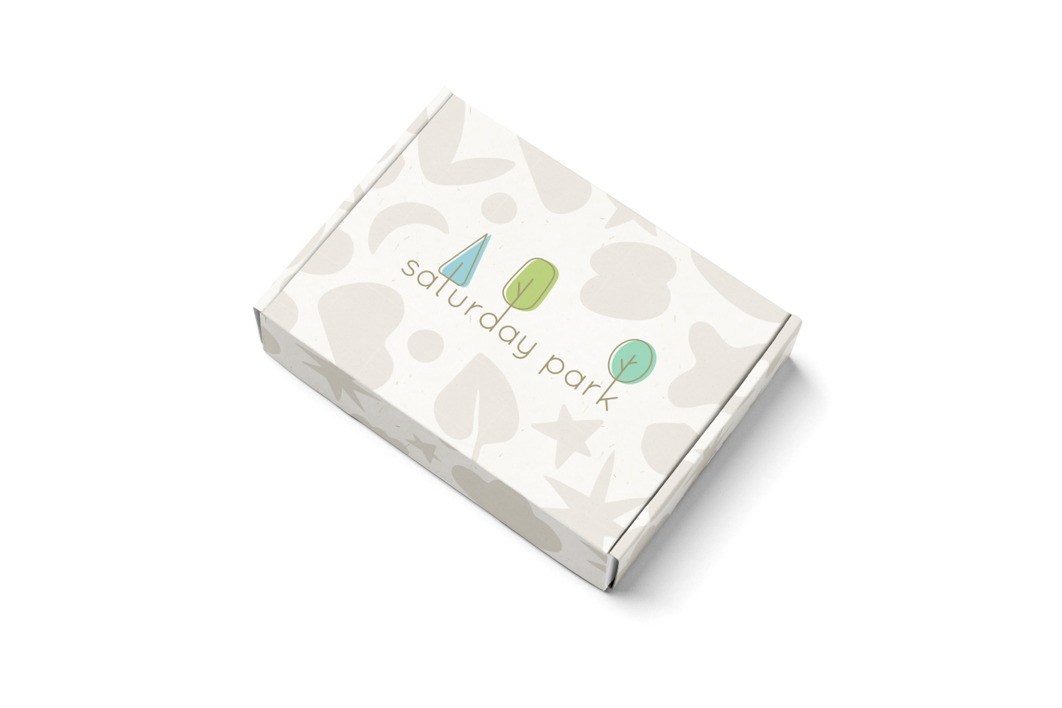
We were able to communicate a connection to the raw materials by utilizing natural paper textures with visible pulp. We created a core icon set of slightly abstracted natural shapes like leaves, clouds, flowers and stars that resembled cut paper.
We created a soft, neutral palette with accents of muted color reminiscent of a sunny day spent outdoors. We assembled the elements in a whimsical collage style that is both playful and elegant, to appeal to a mother who is as design conscious as she is eco-conscious.
Packaging Design
We created packaging that reflected the soft organic feeling of the brand. We specified natural materials whenever possible with matte textures and visible paper pulp.


Icons
We created an icon set which the client could use for various applications—from their website product detail pages to their packaging or sewn-in labels.
Brand Guidelines
We made an extensive style guide which specified everything from basic elements like fonts and textures to more complex concepts like the do’s and don’ts of creating website banners.
The guidelines were delivered to the client along with the original art files for each piece of artwork.


